 Skip to content

How We Select New Print Patterns
Every spring, and sometimes in fall too, Po Campo releases a new print pattern. We’re known for our fun prints and are often asked how we come up with the new designs. Read this blog post to learn our process.
Why Print Patterns?
When I started Po Campo with my good friend and fellow industrial designer Emily Taylor, one thing we knew we wanted to incorporate into our design was color and pattern.
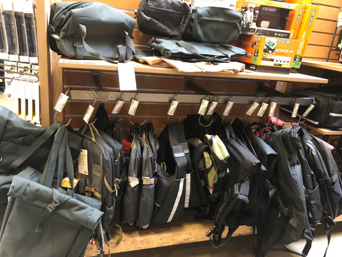
- Bike bags were pretty much just black (and still are today, here’s a typical wall of bike bags in a shop) and we felt strongly that this was selling this product category short. Biking is fun, figuring out how to carry things on your bike is fun, so why are all the solutions so … drab???
- We personally loved color and pattern and wanted to incorporate it into our product line. We called our aesthetic “Midwest eclectic”, giving nod to our Chicago roots and the funky clothes we would find in thrift stores in the area
In the beginning, we scoured the web for readymade outdoor fabrics, which by nature were more durable and water resistant because they’re intended for umbrellas and outdoor cushions. Eventually Po Campo grew large enough where we could make our own fabrics, which meant we could make any.design.we.wanted. Here’s the process we developed for choosing our new print patterns.
Step One: Trend Research
We know for a lot of our customers, their Po Campo bags can be some of the most stylish and “on-trend” things that they own and I take that responsibility very seriously. I enjoy spending time researching trends and developing our prints, paying attention to these things so you don’t have to.
One thing I personally love about fashion is how it expresses the zeitgeist of the time in which we live. Discovering trends that resonate with our community allows us to express something collectively, which is such an important part of our brand. I really feel like we are building and experiencing Po Campo together.
Naturally then, my first step is trend research. I look through the trend reports on WGSN, monitor street style IG profiles, get inspiration from other brands I admire, and just try and take the pulse on what is going on in with colors and print patterns.
Next, I compile my top three or so trends with notes for creative direction about why I think they suit Po Campo in this specific day and age. “Groovy Vintage” was a trend I spotted last year, the foundation to the Meadow print we launched this year.

I had been noticing a “vibe shift” coming out of the pandemic that was going away from subtle and neutral shades towards bolder colors and louder patterns. I think this is part of the appeal of Groovy Vintage from a cultural perspective. The world has been through a lot the last couple years with plenty of crucibles on the horizon. These groovy prints are fun, an escape, and a memory of simpler time - kind of like biking.
After I settle on a couple of trends, I look at activewear color trends for whatever season we are designing for. There’s no crystal ball for color but if activewear, bikes and other active gear are all going to be in a certain palette for a certain season, I want to try and match it as best we can. People like to match their bags to their bikes!
Step Two: Print Research & Evaluation
After the design themes are settled, I start looking for print patterns to license that fit the concepts and work well with our bags. In general we are looking for print patterns that:
- Have “movement”, which is important to us as an active outdoor brand
- Have lots of colors, which makes it easier to match with bikes
- Are non-directional repeats, meaning there is no up or down or right or left so that we can make a big roll of fabric and maximize its consumption
- Work on small and large bags
I peruse sites like PatternBank and Spoonflower, catch-up on hashtags like #surfacedesign and #patterndesign on Instagram, etc. I find scrolling through print pattern designs to be incredibly fun and inspiring. I love all the creativity in this space and it is often hard to narrow down to a few choices.
Once I’ve gathered some candidates for possible print patterns, I share the options with my team. We all vote on which ones we are most excited about, and then the product team and I will put together our final slate of 5 or 6 prints to share with our customers and get their input.

At this stage, colors and scale aren't finalized but we do what we can to make the mock-ups as realistic as possible to help people select their favorites. We've learned that it is really hard to separate pattern from color in assessing design options!
Step Three: Fine Tune Print
The last step is to select the final print and fine tune it so that it is ready for production.
The survey usually yields one or two top contenders. We’ll make mock-ups of the lead prints on bags and then debate if we should choose this one or that one. We argue about which print will be a better replacement for an outgoing print, which has more versatility across our line, which we feel will be most timely a year from now. It’s more art than science which is why it takes so much discussion.
After we select our winning print, we license the print for production and start tinkering with both color and scale.
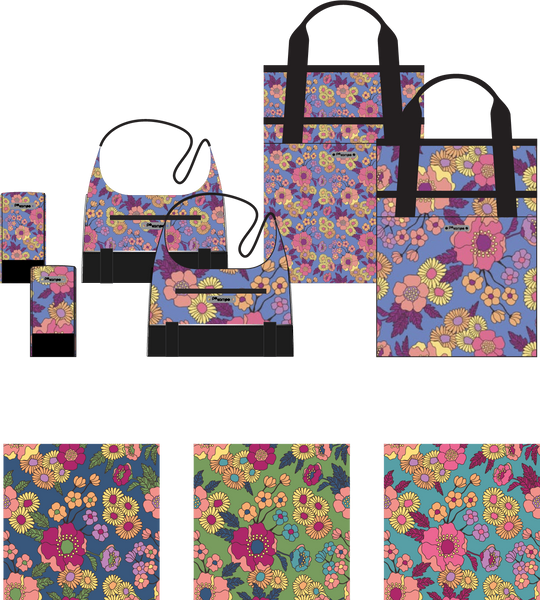
Scale can be a particularly tough nut to crack. We want to get enough of the pattern on the smallest bag, the Hudson Saddle Bag, so that you know what you’re looking at. On the opposite end of the spectrum, we don’t want a large bag, like the Orchard Grocery Pannier, to feel too busy with a small pattern. For Meadow, we wanted to make sure that every small bag got at least one complete flower.
Color can be similarly tricky. If a pattern has, say, 5 colors in it, we try for all colors to show up on the front of all bags so people know what they’re getting. In other words, we don’t want someone to see the picture online and think, “Oh, it has purple flowers - it will match my bike perfectly” only to receive a bag that has mostly yellow flowers.
Once we feel good about the print in the colors and scale, our sample room digitally prints some fabric so that we can see it in person. Often more debate occurs at this stage, if colors should be a little warmer or cooler, or if scale should be a little larger or a little smaller. Once we are satisfied, we make samples of finished small and larger bags to make sure we’re happy with the decision.
Fast forward about 10 months when it is time to launch a print, we revisit the original inspiration to help guide the photo and video shoots for the bags. See the connective tissue from where we started to where we ended up?

Po Campo Future Prints
Want to be a part of future design surveys? Please fill out the form below.
Other Blog Posts You May Like
- My Design Process: Parts One, Two, and Three
- Designing for the Future of Micromobility
- Designing Po Campo's Kids Bags
Leave a comment